/* UeberUnsPage.jsx — /ueber-uns: About page */

/* ── Founder Story with layered photos ── */
const AboutFounder = () => (
  <section className="section aurora grain-light r-up" data-screen-label="AboutFounder">
    <div className="container">
      <div style={{ display: 'grid', gridTemplateColumns: '5fr 7fr', gap: 'clamp(40px, 6vw, 96px)', alignItems: 'center' }} className="af-grid">
        <div className="af-portrait" style={{ position: 'relative' }}>
          <div style={{ position: 'relative', aspectRatio: '4/5', overflow: 'hidden', borderRadius: 4, background: 'var(--bg-3)' }}>
            <img
              src="assets/carl-portrait.jpg"
              alt="Carl Wiesemann, Gründer Cawi-Media"
              style={{ width: '100%', height: '100%', objectFit: 'cover', objectPosition: 'center 25%' }}
            />
          </div>
          <div style={{ marginTop: 32, fontSize: 13, color: 'var(--fg-3)', letterSpacing: '0.02em' }}>
            Carl Wiesemann&nbsp;·&nbsp;Gründer Cawi-Media
          </div>
        </div>

        <div>
          <div className="eyebrow eyebrow-row" style={{ marginBottom: 32 }}><span className="eyebrow-dot" /> Über Carl Wiesemann</div>
          <h2 style={{ fontSize: 'var(--fs-display-m)', fontWeight: 500, lineHeight: 1.08, letterSpacing: '-0.02em', margin: 0, maxWidth: '22ch', textWrap: 'balance' }}>
            Aus der Industrie in die <em style={{ fontFamily: 'var(--font-serif)', fontWeight: 400 }}>Digitalisierung.</em>
          </h2>
          <div style={{ marginTop: 40, display: 'flex', flexDirection: 'column', gap: 20, fontSize: 17, lineHeight: 1.65, color: 'var(--fg-2)', maxWidth: '58ch' }}>
            <p>
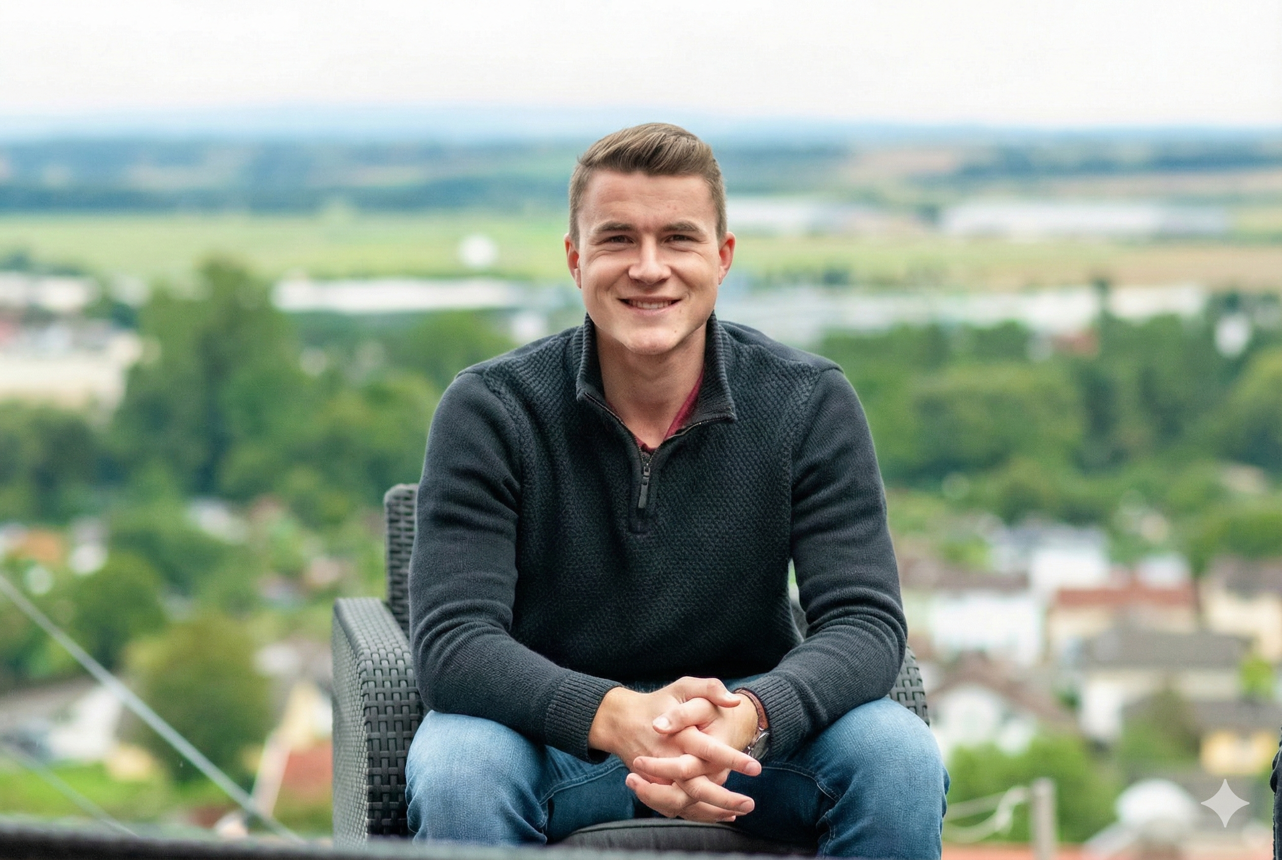
              Nach einer Ausbildung in der Industrie hat Carl Wiesemann 2020 Cawi-Media gegründet. Seitdem begleitet er inhabergeführte Unternehmen bei der Einführung digitaler Werkzeuge und KI-Lösungen.
            </p>
            <p>
              Die spannendsten Lösungen entstehen nicht am Reißbrett, sondern im Gespräch mit den Menschen, die täglich mit den Prozessen arbeiten. Buchhaltung, Vertrieb, Produktion: dort liegt das Wissen, dort liegen auch die blinden Flecken.
            </p>
            <p>
              Die Aufgabe: dieses Wissen strukturieren und in konkrete, umsetzbare Lösungen übersetzen. Keine Folien. Keine Jargon-Workshops. Technik, die arbeitet und bleibt.
            </p>
          </div>
        </div>
      </div>
    </div>
    <style>{`
      .af-portrait-accent {
        position: absolute;
        right: -24px;
        bottom: 64px;
        width: 46%;
        aspect-ratio: 4/5;
        overflow: hidden;
        border-radius: 4px;
        box-shadow: 0 24px 60px -20px rgba(0,0,0,0.35), 0 0 0 8px var(--bg-1);
        background: var(--bg-3);
      }
      @media (max-width: 880px) {
        .af-grid { grid-template-columns: 1fr !important; gap: 40px !important; }
        .af-portrait { max-width: 460px; }
        .af-portrait-accent { right: -16px; width: 40%; }
      }
    `}</style>
  </section>
);

/* ── Photo strip: "Ein Tag mit Cawi-Media" — 3 on-site photos ── */
const AboutDay = () => {
  const photos = [
    { src: 'assets/photos/carl-onsite-hallway.jpg', label: 'Kennenlernen', caption: 'In der Regel vor Ort, auf Wunsch auch komplett remote. Wichtig ist der ehrliche Austausch.' },
    { src: 'assets/photos/carl-client-dreyer.jpg', label: 'Workshop', caption: 'Gemeinsam mit Inhaber:innen und Team. Prozesse vom Schreibtisch aus verstehen.' },
    { src: 'assets/photos/carl-deskwork.jpg', label: 'Umsetzung', caption: 'Zurück im Büro: Roadmap übersetzen, Systeme bauen, Code schreiben.' },
  ];
  return (
    <section className="section-dark aurora aurora-dark grain beam beam-inverse" data-screen-label="AboutDay" style={{ position: 'relative', overflow: 'hidden' }}>
      {/* Ambient gradient blob — very subtle, signals modernity */}
      <div aria-hidden style={{
        position: 'absolute', inset: 0, zIndex: 0, pointerEvents: 'none',
        background: 'radial-gradient(800px 400px at 20% 0%, rgba(21,84,168,0.18), transparent 70%), radial-gradient(700px 500px at 90% 100%, rgba(182,136,74,0.12), transparent 70%)',
      }} />
      <div className="container" style={{ position: 'relative', zIndex: 1 }}>
        <div style={{ maxWidth: 720, marginBottom: 'clamp(56px, 7vw, 96px)' }}>
          <div className="eyebrow eyebrow-row" style={{ marginBottom: 28, color: 'rgba(255,255,255,0.68)' }}>
            <span className="eyebrow-dot" style={{ background: 'rgba(255,255,255,0.5)' }} /> So arbeiten wir
          </div>
          <h2 style={{ fontSize: 'var(--fs-display-m)', fontWeight: 500, lineHeight: 1.08, letterSpacing: '-0.02em', margin: 0, color: '#fff', textWrap: 'balance' }}>
            Vom ersten Besuch bis zur <em style={{ fontFamily: 'var(--font-serif)', fontWeight: 400 }}>laufenden Lösung.</em>
          </h2>
        </div>
        <div className="day-grid">
          {photos.map((p, i) => (
            <figure key={i} className="day-card r-up" style={{ transitionDelay: (80 + i*120) + 'ms' }}>
              <div className="day-media">
                <img src={p.src} alt={p.caption} />
                <div className="day-overlay" aria-hidden />
              </div>
              <figcaption>
                <div className="day-meta">
                  <span className="day-label">{p.label}</span>
                </div>
                <p className="day-caption">{p.caption}</p>
              </figcaption>
            </figure>
          ))}
        </div>
      </div>
      <style>{`
        .section-dark { background: var(--color-ink, #0a0c10); padding: clamp(96px, 12vw, 160px) 0; color: rgba(255,255,255,0.88); }
        .day-grid { display: grid; grid-template-columns: repeat(3, 1fr); gap: clamp(24px, 2.5vw, 40px); }
        .day-card { margin: 0; display: flex; flex-direction: column; gap: 24px; }
        .day-media { position: relative; aspect-ratio: 3/4; overflow: hidden; border-radius: 6px; background: rgba(255,255,255,0.05); }
        .day-media img { width: 100%; height: 100%; object-fit: cover; filter: saturate(0.88) contrast(1.04); transition: transform 800ms var(--ease-out), filter 400ms; }
        .day-overlay { position: absolute; inset: 0; background: linear-gradient(180deg, transparent 40%, rgba(0,0,0,0.35) 100%); }
        .day-card:hover .day-media img { transform: scale(1.03); filter: saturate(1) contrast(1.06); }
        .day-meta { display: flex; align-items: center; gap: 14px; margin-bottom: 10px; }
        .day-num { font-family: var(--font-mono); font-size: 12px; color: var(--color-accent-warm, #c29a64); letter-spacing: 0.08em; }
        .day-label { font-size: 12px; letter-spacing: 0.14em; text-transform: uppercase; color: rgba(255,255,255,0.55); font-weight: 500; }
        .day-caption { font-size: 15px; line-height: 1.55; color: rgba(255,255,255,0.82); margin: 0; max-width: 34ch; }
        @media (max-width: 880px) { .day-grid { grid-template-columns: 1fr; } }
      `}</style>
    </section>
  );
};

/* ── Werte ── */
const AboutValues = () => {
  const values = [
    {
      t: 'Kompromisslos',
      b: 'Wir sagen, was geht und was nicht. Wenn KI bei Ihnen keinen Mehrwert bringt, hören Sie das von uns. Und sparen sich das Budget.',
      icon: <window.Icon.Compass size={28} />,
    },
    {
      t: 'Nachhaltig',
      b: 'Wir bauen Lösungen, die Ihr Team langfristig selbst tragen und weiterentwickeln kann. Dokumentiert, wartbar, ohne Vendor-Lock-in.',
      icon: <window.Icon.Shield size={28} />,
    },
    {
      t: 'Bauen',
      b: 'Wir reden nicht nur über Konzepte, wir setzen um. Code, Systeme, Integrationen. Greifbare Ergebnisse statt Folien.',
      icon: <window.Icon.Hammer size={28} />,
    },
    {
      t: 'Begleitend',
      b: 'Auf Wunsch übernehmen wir auch die fortlaufende Wartung Ihrer Systeme. So bleibt die Lösung verlässlich, lange nach dem Go-Live.',
      icon: <window.Icon.Heart size={28} />,
    },
  ];
  return (
    <section className="section bg-soft" data-screen-label="AboutValues">
      <div className="container">
        <div style={{ maxWidth: 720, marginBottom: 'clamp(56px, 7vw, 96px)' }}>
          <div className="eyebrow eyebrow-row" style={{ marginBottom: 28 }}><span className="eyebrow-dot" /> Wofür wir stehen</div>
          <h2 style={{ fontSize: 'var(--fs-display-m)', fontWeight: 500, lineHeight: 1.08, letterSpacing: '-0.02em', margin: 0, textWrap: 'balance' }}>
            Vier Grundsätze. <em style={{ fontFamily: 'var(--font-serif)', fontWeight: 400 }}>Kompromisslos.</em>
          </h2>
        </div>
        <div style={{ display: 'grid', gridTemplateColumns: 'repeat(2, 1fr)', gap: 1, background: 'var(--border-hairline)', border: '1px solid var(--border-hairline)' }} className="av-grid">
          {values.map((v, i) => (
            <article key={v.t} className="av-card r-up lift" style={{ background: '#fff', padding: 'clamp(32px, 3.5vw, 56px)', minHeight: 260, transitionDelay: (80 + i*80) + 'ms' }}>
              <div className="av-icon" aria-hidden>{v.icon}</div>
              <h3 style={{ fontFamily: 'var(--font-serif)', fontStyle: 'italic', fontSize: 36, fontWeight: 400, lineHeight: 1.05, letterSpacing: '-0.02em', margin: '0 0 20px', color: 'var(--fg-1)' }}>{v.t}</h3>
              <p style={{ fontSize: 16, lineHeight: 1.6, color: 'var(--fg-2)', margin: 0, maxWidth: '42ch' }}>{v.b}</p>
            </article>
          ))}
        </div>
      </div>
      <style>{`
        .av-icon {
          color: var(--color-accent);
          margin-bottom: 28px;
          width: 56px; height: 56px;
          border: 1px solid var(--border-hairline);
          border-radius: 999px;
          display: inline-flex;
          align-items: center;
          justify-content: center;
          background: linear-gradient(135deg, rgba(21,84,168,0.05) 0%, transparent 60%);
        }
        @media (max-width: 720px){ .av-grid { grid-template-columns: 1fr !important; } }
      `}</style>
    </section>
  );
};

/* ── Standort with stylized dark map ── */
const AboutLocation = () => (
  <section className="section dotgrid" data-screen-label="AboutLocation">
    <div className="container">
      <div style={{ display: 'grid', gridTemplateColumns: '1fr 1fr', gap: 'clamp(40px, 5vw, 96px)', alignItems: 'center' }} className="loc-grid">
        <div>
          <div className="eyebrow eyebrow-row" style={{ marginBottom: 28 }}><span className="eyebrow-dot" /> Standort</div>
          <h2 style={{ fontSize: 'var(--fs-h1)', fontWeight: 500, lineHeight: 1.1, letterSpacing: '-0.02em', margin: 0, maxWidth: '18ch', textWrap: 'balance' }}>
            Aus Fritzlar. Für den <em style={{ fontFamily: 'var(--font-serif)', fontWeight: 400 }}>Mittelstand</em> im deutsch­sprachigen Raum.
          </h2>
          <p style={{ marginTop: 32, fontSize: 17, lineHeight: 1.55, color: 'var(--fg-2)', maxWidth: '46ch' }}>
            Unser Büro sitzt in Hessen, mitten im Herzen Deutschlands. Wir arbeiten remote, kommen aber gerne auch vor Ort. Kunden begleiten wir von Schleswig-Holstein bis in die Schweiz.
          </p>
          <div style={{ marginTop: 24 }}>
            <a
              href="https://www.google.com/maps/place/St.-Wigbert-Stra%C3%9Fe+30,+34560+Fritzlar"
              target="_blank"
              rel="noopener noreferrer"
              className="link-arrow"
              style={{ fontSize: 14 }}
            >
              In Google Maps öffnen <span className="arrow" aria-hidden>→</span>
            </a>
          </div>
          <div style={{ marginTop: 40, display: 'grid', gridTemplateColumns: 'repeat(2, 1fr)', gap: 32, maxWidth: 480 }} className="al-meta">
            <div>
              <div className="eyebrow" style={{ color: 'var(--fg-3)', marginBottom: 10 }}>Adresse</div>
              <div style={{ fontSize: 14, lineHeight: 1.6, color: 'var(--fg-1)' }}>
                Cawi-Media<br />
                St.-Wigbert-Straße 30<br />
                34560 Fritzlar, Hessen
              </div>
            </div>
            <div>
              <div className="eyebrow" style={{ color: 'var(--fg-3)', marginBottom: 10 }}>Kontakt</div>
              <div style={{ fontSize: 14, lineHeight: 1.6, color: 'var(--fg-1)' }}>
                <a href="mailto:info@cawi-media.de" style={{ color: 'inherit' }}>info@cawi-media.de</a><br />
                <a href="tel:+4917681522326" style={{ color: 'inherit' }}>+49 176 81522326</a>
              </div>
            </div>
          </div>
        </div>

        {/* Embedded Google Maps — real link out, interactive iframe */}
        <div className="loc-map-wrap">
          <a
            href="https://www.google.com/maps/place/St.-Wigbert-Stra%C3%9Fe+30,+34560+Fritzlar"
            target="_blank"
            rel="noopener noreferrer"
            aria-label="Cawi-Media auf Google Maps öffnen"
            className="loc-map-link"
          >
            <iframe
              title="Cawi-Media Standort Fritzlar"
              src="https://www.google.com/maps?q=St.-Wigbert-Stra%C3%9Fe+30,+34560+Fritzlar&hl=de&z=14&output=embed"
              loading="lazy"
              referrerPolicy="no-referrer-when-downgrade"
              style={{ border: 0, width: '100%', height: '100%', display: 'block', filter: 'grayscale(0.15) contrast(1.02)' }}
              allowFullScreen
            />
            <span className="loc-map-legend">
              <span className="loc-map-pin" aria-hidden />
              <span>Fritzlar&nbsp;·&nbsp;Hessen</span>
            </span>
            <span className="loc-map-open">
              Google Maps <span aria-hidden>↗</span>
            </span>
          </a>
        </div>
      </div>
    </div>
    <style>{`
      .loc-map-wrap { position: relative; aspect-ratio: 4/5; border-radius: 6px; overflow: hidden; background: #eef1f4; box-shadow: 0 24px 60px -24px rgba(0,0,0,0.25); }
      .loc-map-link { display: block; width: 100%; height: 100%; position: relative; text-decoration: none; color: inherit; }
      .loc-map-link iframe { pointer-events: auto; }
      .loc-map-legend {
        position: absolute; bottom: 20px; left: 20px;
        display: inline-flex; align-items: center; gap: 10px;
        padding: 10px 14px;
        background: rgba(14,17,22,0.92); backdrop-filter: blur(8px);
        border: 1px solid rgba(255,255,255,0.08);
        border-radius: 999px;
        color: rgba(255,255,255,0.9);
        font-size: 12px; letter-spacing: 0.08em; text-transform: uppercase; font-weight: 500;
        pointer-events: none;
      }
      .loc-map-open {
        position: absolute; top: 16px; right: 16px;
        display: inline-flex; align-items: center; gap: 8px;
        padding: 8px 14px;
        background: #fff;
        border: 1px solid rgba(0,0,0,0.08);
        border-radius: 999px;
        color: var(--fg-1);
        font-size: 12px; letter-spacing: 0.04em; font-weight: 500;
        box-shadow: 0 6px 20px -8px rgba(0,0,0,0.25);
        pointer-events: none;
      }
      .loc-map-pin { width: 8px; height: 8px; border-radius: 50%; background: var(--color-accent); box-shadow: 0 0 0 3px rgba(21,84,168,0.25); }
      @media (max-width:880px){
        .loc-grid { grid-template-columns: 1fr !important; }
        .loc-map-wrap { aspect-ratio: 4/3; }
        .al-meta { grid-template-columns: 1fr !important; gap: 20px !important; }
      }
    `}</style>
  </section>
);

/* Stylized SVG map: abstract Germany outline + pin on Fritzlar's rough location */
const StyledMap = () => (
  <svg viewBox="0 0 400 500" preserveAspectRatio="xMidYMid slice" style={{ width: '100%', height: '100%', display: 'block' }} aria-hidden>
    <defs>
      <radialGradient id="mapGlow" cx="52%" cy="48%" r="38%">
        <stop offset="0%" stopColor="rgba(21,84,168,0.35)" />
        <stop offset="100%" stopColor="rgba(21,84,168,0)" />
      </radialGradient>
      <pattern id="grid" width="28" height="28" patternUnits="userSpaceOnUse">
        <path d="M 28 0 L 0 0 0 28" fill="none" stroke="rgba(255,255,255,0.04)" strokeWidth="1" />
      </pattern>
      <filter id="blur2">
        <feGaussianBlur stdDeviation="0.5" />
      </filter>
    </defs>

    {/* Base */}
    <rect width="400" height="500" fill="#0e1116" />
    <rect width="400" height="500" fill="url(#grid)" />
    {/* Ambient glow over the location */}
    <rect width="400" height="500" fill="url(#mapGlow)" />

    {/* Simplified Germany outline — stylized, not cartographic. Centered. */}
    <g transform="translate(200 250)" stroke="rgba(255,255,255,0.28)" strokeWidth="1.2" fill="rgba(255,255,255,0.03)" strokeLinejoin="round">
      <path d="M -70 -170 L -40 -180 L -10 -175 L 20 -182 L 50 -172 L 70 -160 L 82 -140 L 88 -110 L 100 -90 L 110 -65 L 120 -40 L 130 -10 L 128 20 L 115 55 L 95 85 L 80 115 L 60 140 L 45 160 L 20 175 L -10 180 L -40 170 L -60 150 L -75 125 L -90 105 L -105 80 L -110 55 L -115 25 L -110 0 L -105 -30 L -100 -60 L -95 -90 L -88 -120 L -78 -150 Z" filter="url(#blur2)" />
    </g>

    {/* Sibling country outlines — very faint */}
    <g stroke="rgba(255,255,255,0.06)" strokeWidth="1" fill="none">
      <path d="M 40 100 L 80 80 L 130 70 L 170 50" />
      <path d="M 300 60 L 340 90 L 360 130" />
      <path d="M 60 380 L 120 420 L 180 430 L 240 420" />
      <path d="M 340 350 L 320 400 L 280 430" />
    </g>

    {/* Pin ring — Fritzlar is slightly north of center. We place accent pin at ~53% horizontal, 45% vertical */}
    <g transform="translate(208 225)">
      {/* Outer halo */}
      <circle r="40" fill="rgba(21,84,168,0.08)" />
      <circle r="26" fill="rgba(21,84,168,0.16)" />
      <circle r="14" fill="rgba(21,84,168,0.38)">
        <animate attributeName="r" values="14;20;14" dur="3.2s" repeatCount="indefinite" />
        <animate attributeName="opacity" values="0.38;0.1;0.38" dur="3.2s" repeatCount="indefinite" />
      </circle>
      {/* Pin */}
      <circle r="6" fill="#1554A8" stroke="#fff" strokeWidth="1.5" />
    </g>

    {/* Label — tiny mono caption near pin */}
    <g transform="translate(224 220)" fontFamily="ui-monospace, monospace" fontSize="9" fill="rgba(255,255,255,0.6)" letterSpacing="1.2">
      <text>FRITZLAR · HE</text>
      <text y="12" fill="rgba(255,255,255,0.3)">51.1333° N · 9.2667° E</text>
    </g>
  </svg>
);

Object.assign(window, { AboutFounder, AboutDay, AboutValues, AboutLocation });
