/* UeberUnsPage.jsx (EN) — /ueber-uns: About page */

const AboutFounder = () => (
  <section className="section aurora grain-light r-up" data-screen-label="AboutFounder">
    <div className="container">
      <div style={{ display: 'grid', gridTemplateColumns: '5fr 7fr', gap: 'clamp(40px, 6vw, 96px)', alignItems: 'center' }} className="af-grid">
        <div className="af-portrait" style={{ position: 'relative' }}>
          <div style={{ position: 'relative', aspectRatio: '4/5', overflow: 'hidden', borderRadius: 4, background: 'var(--bg-3)' }}>
            <img src="../assets/carl-portrait.jpg" alt="Carl Wiesemann, Founder of Cawi Media" style={{ width: '100%', height: '100%', objectFit: 'cover', objectPosition: 'center 25%' }} />
          </div>
          <div style={{ marginTop: 32, fontSize: 13, color: 'var(--fg-3)', letterSpacing: '0.02em' }}>
            Carl Wiesemann&nbsp;·&nbsp;Founder, Cawi Media
          </div>
        </div>
        <div>
          <div className="eyebrow eyebrow-row" style={{ marginBottom: 32 }}><span className="eyebrow-dot" /> About Carl Wiesemann</div>
          <h2 style={{ fontSize: 'var(--fs-display-m)', fontWeight: 500, lineHeight: 1.08, letterSpacing: '-0.02em', margin: 0, maxWidth: '22ch', textWrap: 'balance' }}>
            From industry to <em style={{ fontFamily: 'var(--font-serif)', fontWeight: 400 }}>digitalization.</em>
          </h2>
          <div style={{ marginTop: 40, display: 'flex', flexDirection: 'column', gap: 20, fontSize: 17, lineHeight: 1.65, color: 'var(--fg-2)', maxWidth: '58ch' }}>
            <p>
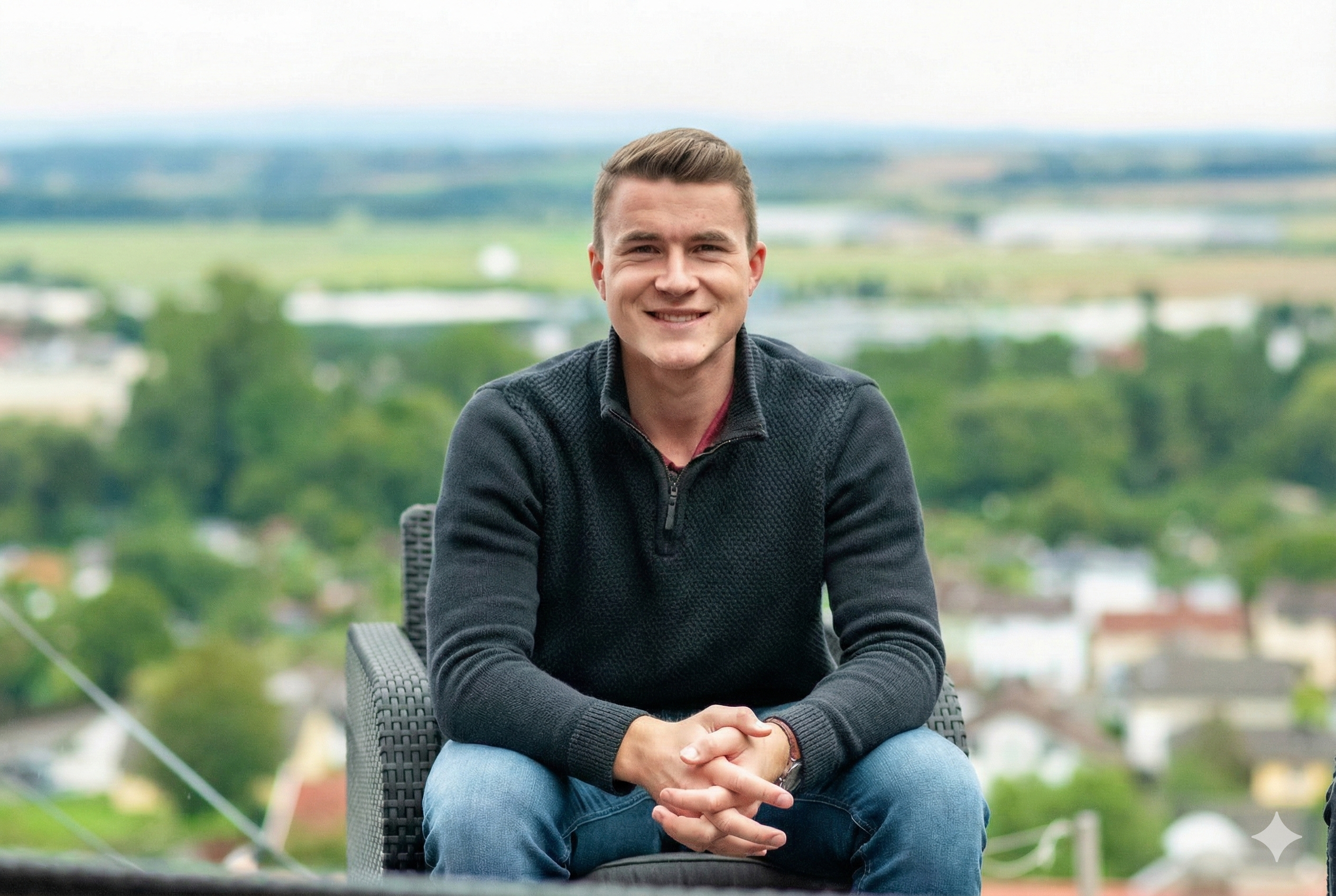
              After training in industry, Carl Wiesemann founded Cawi Media in 2020. Since then, he has supported owner-led companies in introducing digital tools and AI solutions.
            </p>
            <p>
              The most exciting solutions don't emerge at the drawing board, but in conversations with the people who work with the processes every day. Accounting, sales, production: that's where the knowledge lives, and that's where the blind spots are too.
            </p>
            <p>
              The job: structure that knowledge and translate it into concrete, actionable solutions. No slides. No jargon workshops. Technology that works and stays.
            </p>
          </div>
        </div>
      </div>
    </div>
    <style>{`
      @media (max-width: 880px) {
        .af-grid { grid-template-columns: 1fr !important; gap: 40px !important; }
        .af-portrait { max-width: 460px; }
      }
    `}</style>
  </section>
);

const AboutDay = () => {
  const photos = [
    { src: '../assets/photos/carl-onsite-hallway.jpg', label: 'Getting acquainted', caption: 'Usually on-site, on request also fully remote. What matters is the honest exchange.' },
    { src: '../assets/photos/carl-client-dreyer.jpg', label: 'Workshop', caption: 'Together with owners and team. Understand processes from the desk where they happen.' },
    { src: '../assets/photos/carl-deskwork.jpg', label: 'Implementation', caption: 'Back at the office: translate the roadmap, build systems, write code.' },
  ];
  return (
    <section className="section-dark aurora aurora-dark grain beam beam-inverse" data-screen-label="AboutDay" style={{ position: 'relative', overflow: 'hidden' }}>
      <div aria-hidden style={{
        position: 'absolute', inset: 0, zIndex: 0, pointerEvents: 'none',
        background: 'radial-gradient(800px 400px at 20% 0%, rgba(21,84,168,0.18), transparent 70%), radial-gradient(700px 500px at 90% 100%, rgba(182,136,74,0.12), transparent 70%)',
      }} />
      <div className="container" style={{ position: 'relative', zIndex: 1 }}>
        <div style={{ maxWidth: 720, marginBottom: 'clamp(56px, 7vw, 96px)' }}>
          <div className="eyebrow eyebrow-row" style={{ marginBottom: 28, color: 'rgba(255,255,255,0.68)' }}>
            <span className="eyebrow-dot" style={{ background: 'rgba(255,255,255,0.5)' }} /> How we work
          </div>
          <h2 style={{ fontSize: 'var(--fs-display-m)', fontWeight: 500, lineHeight: 1.08, letterSpacing: '-0.02em', margin: 0, color: '#fff', textWrap: 'balance' }}>
            From the first visit to the <em style={{ fontFamily: 'var(--font-serif)', fontWeight: 400 }}>running solution.</em>
          </h2>
        </div>
        <div className="day-grid">
          {photos.map((p, i) => (
            <figure key={i} className="day-card r-up" style={{ transitionDelay: (80 + i*120) + 'ms' }}>
              <div className="day-media">
                <img src={p.src} alt={p.caption} />
                <div className="day-overlay" aria-hidden />
              </div>
              <figcaption>
                <div className="day-meta">
                  <span className="day-label">{p.label}</span>
                </div>
                <p className="day-caption">{p.caption}</p>
              </figcaption>
            </figure>
          ))}
        </div>
      </div>
      <style>{`
        .section-dark { background: var(--color-ink, #0a0c10); padding: clamp(96px, 12vw, 160px) 0; color: rgba(255,255,255,0.88); }
        .day-grid { display: grid; grid-template-columns: repeat(3, 1fr); gap: clamp(24px, 2.5vw, 40px); }
        .day-card { margin: 0; display: flex; flex-direction: column; gap: 24px; }
        .day-media { position: relative; aspect-ratio: 3/4; overflow: hidden; border-radius: 6px; background: rgba(255,255,255,0.05); }
        .day-media img { width: 100%; height: 100%; object-fit: cover; filter: saturate(0.88) contrast(1.04); transition: transform 800ms var(--ease-out), filter 400ms; }
        .day-overlay { position: absolute; inset: 0; background: linear-gradient(180deg, transparent 40%, rgba(0,0,0,0.35) 100%); }
        .day-card:hover .day-media img { transform: scale(1.03); filter: saturate(1) contrast(1.06); }
        .day-meta { display: flex; align-items: center; gap: 14px; margin-bottom: 10px; }
        .day-label { font-size: 12px; letter-spacing: 0.14em; text-transform: uppercase; color: rgba(255,255,255,0.55); font-weight: 500; }
        .day-caption { font-size: 15px; line-height: 1.55; color: rgba(255,255,255,0.82); margin: 0; max-width: 34ch; }
        @media (max-width: 880px) { .day-grid { grid-template-columns: 1fr; } }
      `}</style>
    </section>
  );
};

const AboutValues = () => {
  const values = [
    { t: 'Honest', b: 'We say what works and what does not. If AI brings no value to your business, you will hear it from us. And keep the budget.', icon: <window.Icon.Compass size={28} /> },
    { t: 'Sustainable', b: 'We build solutions your team can support and extend long-term. Documented, maintainable, no vendor lock-in.', icon: <window.Icon.Shield size={28} /> },
    { t: 'Building', b: 'We do not just talk about concepts, we implement. Code, systems, integrations. Tangible results, not slides.', icon: <window.Icon.Hammer size={28} /> },
    { t: 'Continuous', b: 'On request, we also handle ongoing maintenance of your systems. So the solution stays reliable, long after go-live.', icon: <window.Icon.Heart size={28} /> },
  ];
  return (
    <section className="section bg-soft" data-screen-label="AboutValues">
      <div className="container">
        <div style={{ maxWidth: 720, marginBottom: 'clamp(56px, 7vw, 96px)' }}>
          <div className="eyebrow eyebrow-row" style={{ marginBottom: 28 }}><span className="eyebrow-dot" /> What we stand for</div>
          <h2 style={{ fontSize: 'var(--fs-display-m)', fontWeight: 500, lineHeight: 1.08, letterSpacing: '-0.02em', margin: 0, textWrap: 'balance' }}>
            Four principles. <em style={{ fontFamily: 'var(--font-serif)', fontWeight: 400 }}>No compromise.</em>
          </h2>
        </div>
        <div style={{ display: 'grid', gridTemplateColumns: 'repeat(2, 1fr)', gap: 1, background: 'var(--border-hairline)', border: '1px solid var(--border-hairline)' }} className="av-grid">
          {values.map((v, i) => (
            <article key={v.t} className="av-card r-up lift" style={{ background: '#fff', padding: 'clamp(32px, 3.5vw, 56px)', minHeight: 260, transitionDelay: (80 + i*80) + 'ms' }}>
              <div className="av-icon" aria-hidden>{v.icon}</div>
              <h3 style={{ fontFamily: 'var(--font-serif)', fontStyle: 'italic', fontSize: 36, fontWeight: 400, lineHeight: 1.05, letterSpacing: '-0.02em', margin: '0 0 20px', color: 'var(--fg-1)' }}>{v.t}</h3>
              <p style={{ fontSize: 16, lineHeight: 1.6, color: 'var(--fg-2)', margin: 0, maxWidth: '42ch' }}>{v.b}</p>
            </article>
          ))}
        </div>
      </div>
      <style>{`
        .av-icon { color: var(--color-accent); margin-bottom: 28px; width: 56px; height: 56px; border: 1px solid var(--border-hairline); border-radius: 999px; display: inline-flex; align-items: center; justify-content: center; background: linear-gradient(135deg, rgba(21,84,168,0.05) 0%, transparent 60%); }
        @media (max-width: 720px){ .av-grid { grid-template-columns: 1fr !important; } }
      `}</style>
    </section>
  );
};

const AboutLocation = () => (
  <section className="section dotgrid" data-screen-label="AboutLocation">
    <div className="container">
      <div style={{ display: 'grid', gridTemplateColumns: '1fr 1fr', gap: 'clamp(40px, 5vw, 96px)', alignItems: 'center' }} className="loc-grid">
        <div>
          <div className="eyebrow eyebrow-row" style={{ marginBottom: 28 }}><span className="eyebrow-dot" /> Location</div>
          <h2 style={{ fontSize: 'var(--fs-h1)', fontWeight: 500, lineHeight: 1.1, letterSpacing: '-0.02em', margin: 0, maxWidth: '18ch', textWrap: 'balance' }}>
            From Fritzlar. For the <em style={{ fontFamily: 'var(--font-serif)', fontWeight: 400 }}>Mittelstand</em> in the German-speaking region.
          </h2>
          <p style={{ marginTop: 32, fontSize: 17, lineHeight: 1.55, color: 'var(--fg-2)', maxWidth: '46ch' }}>
            Our office is in Hessen, in the heart of Germany. We work remotely but are happy to come on-site too. We support clients from Schleswig-Holstein down to Switzerland.
          </p>
          <div style={{ marginTop: 24 }}>
            <a href="https://www.google.com/maps/place/St.-Wigbert-Stra%C3%9Fe+30,+34560+Fritzlar" target="_blank" rel="noopener noreferrer" className="link-arrow" style={{ fontSize: 14 }}>
              Open in Google Maps <span className="arrow" aria-hidden>→</span>
            </a>
          </div>
          <div style={{ marginTop: 40, display: 'grid', gridTemplateColumns: 'repeat(2, 1fr)', gap: 32, maxWidth: 480 }} className="al-meta">
            <div>
              <div className="eyebrow" style={{ color: 'var(--fg-3)', marginBottom: 10 }}>Address</div>
              <div style={{ fontSize: 14, lineHeight: 1.6, color: 'var(--fg-1)' }}>
                Cawi Media<br />
                St.-Wigbert-Straße 30<br />
                34560 Fritzlar, Germany
              </div>
            </div>
            <div>
              <div className="eyebrow" style={{ color: 'var(--fg-3)', marginBottom: 10 }}>Contact</div>
              <div style={{ fontSize: 14, lineHeight: 1.6, color: 'var(--fg-1)' }}>
                <a href="mailto:info@cawi-media.de" style={{ color: 'inherit' }}>info@cawi-media.de</a><br />
                <a href="tel:+4917681522326" style={{ color: 'inherit' }}>+49 176 81522326</a>
              </div>
            </div>
          </div>
        </div>
        <div className="loc-map-wrap">
          <a href="https://www.google.com/maps/place/St.-Wigbert-Stra%C3%9Fe+30,+34560+Fritzlar" target="_blank" rel="noopener noreferrer" aria-label="Open Cawi Media on Google Maps" className="loc-map-link">
            <iframe title="Cawi Media location, Fritzlar" src="https://www.google.com/maps?q=St.-Wigbert-Stra%C3%9Fe+30,+34560+Fritzlar&hl=en&z=14&output=embed" loading="lazy" referrerPolicy="no-referrer-when-downgrade" style={{ border: 0, width: '100%', height: '100%', display: 'block', filter: 'grayscale(0.15) contrast(1.02)' }} allowFullScreen />
            <span className="loc-map-legend">
              <span className="loc-map-pin" aria-hidden />
              <span>Fritzlar&nbsp;·&nbsp;Hessen</span>
            </span>
            <span className="loc-map-open">Google Maps <span aria-hidden>↗</span></span>
          </a>
        </div>
      </div>
    </div>
    <style>{`
      .loc-map-wrap { position: relative; aspect-ratio: 4/5; border-radius: 6px; overflow: hidden; background: #eef1f4; box-shadow: 0 24px 60px -24px rgba(0,0,0,0.25); }
      .loc-map-link { display: block; width: 100%; height: 100%; position: relative; text-decoration: none; color: inherit; }
      .loc-map-link iframe { pointer-events: auto; }
      .loc-map-legend { position: absolute; bottom: 20px; left: 20px; display: inline-flex; align-items: center; gap: 10px; padding: 10px 14px; background: rgba(14,17,22,0.92); backdrop-filter: blur(8px); border: 1px solid rgba(255,255,255,0.08); border-radius: 999px; color: rgba(255,255,255,0.9); font-size: 12px; letter-spacing: 0.08em; text-transform: uppercase; font-weight: 500; pointer-events: none; }
      .loc-map-open { position: absolute; top: 16px; right: 16px; display: inline-flex; align-items: center; gap: 8px; padding: 8px 14px; background: #fff; border: 1px solid rgba(0,0,0,0.08); border-radius: 999px; color: var(--fg-1); font-size: 12px; letter-spacing: 0.04em; font-weight: 500; box-shadow: 0 6px 20px -8px rgba(0,0,0,0.25); pointer-events: none; }
      .loc-map-pin { width: 8px; height: 8px; border-radius: 50%; background: var(--color-accent); box-shadow: 0 0 0 3px rgba(21,84,168,0.25); }
      @media (max-width:880px){
        .loc-grid { grid-template-columns: 1fr !important; }
        .loc-map-wrap { aspect-ratio: 4/3; }
        .al-meta { grid-template-columns: 1fr !important; gap: 20px !important; }
      }
    `}</style>
  </section>
);

Object.assign(window, { AboutFounder, AboutDay, AboutValues, AboutLocation });
